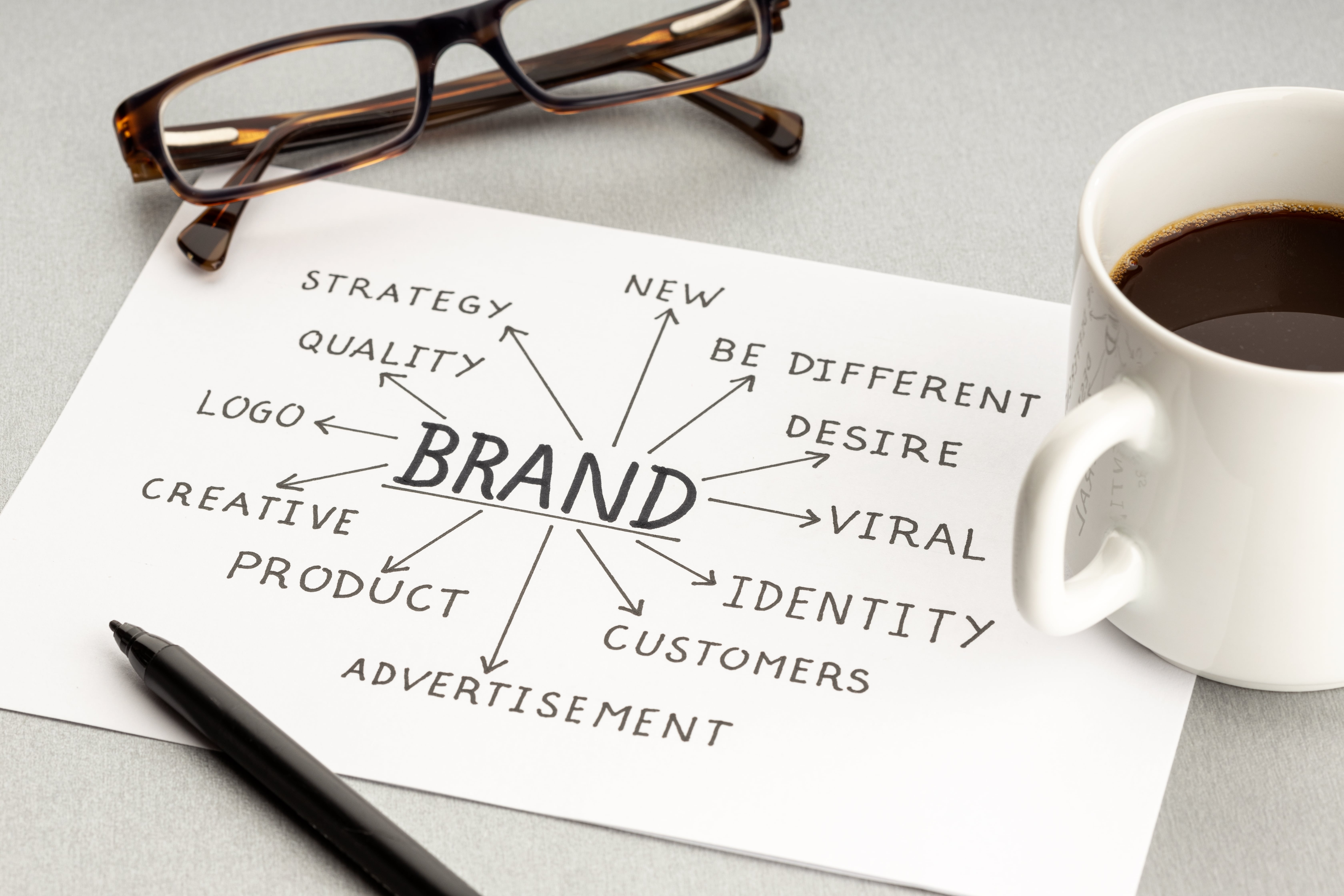
A business rebrand is a strategic move that reflects a company’s evolution, vision, and future direction. In 2024, we saw a number of bold identity shifts from some of the world’s most recognizable brands. From modern refreshes to complete strategic pivots, these redesigns reveal a lot about how brands are positioning themselves in today’s digital, purpose-driven, and fast-paced economy.
Here’s a look at some of the top rebrands of 2024.
Jaguar: Going Electric, With a Little Controversy
Jaguar’s rebrand marked their transition into an all-electric luxury brand by 2026. The new logo featured a mixed-case name, JaGUar, and a refined, minimalist leaping-cat icon. Some loved the sleek redesign; others criticized it for abandoning tradition. Either way, it did what a rebrand is supposed to do. It got people talking and refocused their attention on a new direction.
Key takeaway: Not everyone has to love your rebrand. And sometimes, that’s not a bad thing.
Figma: Expanding the Playground
Figma’s rebrand aimed to appeal not just to designers but to a broader range of creative collaborators. The new design softened visual edges and added flexibility, mirroring its platform’s move toward cross-team workflows.
Key takeaway: As a product evolves, the brand should follow suit to reflect an expanded audience and use case.
7UP: Retro Meets Gen Z Energy
7UP’s 2024 rebrand captures the soda’s signature sparkle with a bold, modern look. Designed to reflect the drink’s bright, citrusy energy, the new identity features a refreshed logo, vibrant green tones, and playful bubble-inspired graphics. It’s a joyful, optimistic update that feels both nostalgic and forward-thinking.
Key takeaway: Leaning into your product’s core traits, like refreshment and fizz, can breathe new life into a legacy brand.
Pepsi: Celebrating 125 Years with a Fresh Take
To mark its 125th anniversary, Pepsi debuted its first major redesign in over a decade. The updated look blended modern typography with a simplified, dynamic logo that nods to past iterations. It’s a masterclass in honoring legacy while staying current.
Key takeaway: Long-standing brands can refresh their identity without losing their core visual DNA.
Bumble: Growing Up, Digitally
Bumble ditched its playful hexagon icon and embraced a mature, wordmark-first approach. The all-caps, sans-serif type treatment suggests confidence, clarity, and a broader purpose beyond just dating.
Key takeaway: Simplifying and maturing a brand can support long-term growth and trust.
Lamborghini: Sleek Subtlety
After more than two decades, Lamborghini unveiled a refreshed logo and visual identity as part of a broader transformation strategy called Direzione Cor Tauri. The update aligns with the brand’s evolving mission to be brave, unexpected, and authentic. It supports its shift toward sustainability, innovation, and decarbonization. The new look modernizes the iconic emblem while preserving its bold spirit, ensuring it resonates with future generations both digitally and culturally.
Key takeaway: A rebrand can honor legacy while signaling a bold, values-driven path forward.
Decathlon: Moving Everyone, Everywhere
Decathlon’s 2024 rebrand introduces the Orbit—a new symbol reflecting motion, inclusivity, and ambition. Inspired by waves, mountains, and the brand’s iconic tilted “A,” it represents Decathlon’s push toward circularity, sustainability, and emotional connection through sport. A brighter blue and modular design system helps the brand speak to all levels—from first-timers to pros.
Key takeaway: A rebrand rooted in movement and meaning can unite purpose, performance, and broad appeal, fostering a unified brand identity.
PayPal: A Simpler, Sharper Future
PayPal’s 2024 rebrand brings a cleaner, more modern identity designed for today’s digital world. The update features a custom typeface (PayPal Pro), refined color palette, and sharper logo, separating the word mark and monogram for greater flexibility. Motion elements like taps and swipes echo real-life payment behaviors, reinforcing ease and accessibility.
Key takeaway: A streamlined identity grounded in clarity and movement helps PayPal feel more intuitive, modern, and built for everyone.
When done right, rebranding can reinvigorate customer interest, clarify messaging, and support growth. But it takes strategy, insight, and a deep understanding of where the brand is going next.
If your business is due for a rebrand, take a cue from these leaders: align your look with your values, communicate clearly, and don’t be afraid to evolve.
Would you like help analyzing or planning your own rebrand? Reach out, we’d love to help.


.png)


